Monday, 30 November 2015

Basic Computer


  TRACING
 This is my first assignment for basic computer subject. During do this task, I'm using Adobe Illustrator software to trace some logo. How did I do? Firstly,I download some logo from website such like Batman logo, AXN logo, Barbie logo etc. Secondly, I choose some pictogram and start to trace it by  using the pen tool to get the shape of the logo. After that, I click the selection tool to pull the shape that  I trace and put it to the other side.Thirdly, I'm using the eyedropped tool to get the same color from the  original logo .Fourthly, I click the type tool to write the first picture is original and the other side picture  is vector. So that, we can see where is the original picture and where is the vector picture. During I do this  task, I faced some tiny problem like using the pen tool. I cannot control that pen while tracing the shape of  the logo. For this task, I hope this task could help me in the future for build my own successful career. Here, some logo that I trace , hope you guys enjoyed !


GRADIENT
For the second task , what we're going to do it is... gradient. This task , I also used the adobe illustrator as my software. Ok, for the first step, I download some fruits from the website and then, open the AI to start make a gradient. Secondly, I used the pen tool to trace it to get the shape of the fruit, and then, used the mesh tool to get the detail of the fruit. Thirdly, I click the layer, and put the image up , and the mesh, down to image. After that, I lock the image and start to take the color from the original picture by using the mesh tool , and then click the place that I want to get the color and I also click the eyedropped tool to get the same color from the fruit. After I finished to take the color from the original picture to the mesh , I click the selection tool to put the vector (mesh) to the other side.Fourthly, I click the type tool to write the first picture is original and the other side picture  is vector. So that, we can see where is the original picture and where is the vector picture. For this task, I faced the same problem when I did the tracing by using the pen tool, too slow to trace the shape of the fruit. But, I really hope this task could help me in the future for build my own successful career. Here, the gradient that I did , hope you guys enjoyed and practice it to be more pro ! Thankssss :)


 ORIGINAL

VECTOR


PHOTOSHOP
1.
BEFORE


AFTER
2.
 BEFORE

 AFTER
3.
 BEFORE

AFTER
4.
 BEFORE

 AFTER


PHOTO MANIPULATED
     Proses:- 


    Final:-


 FINAL TRACING
    Proses:-


Final


Design Fundamental

THE ELEMENTS AND PRINCIPLE OF DESIGN~

THE ELEMENTS OF DESIGN

The elements of design can be thought of as the things that make up a painting, drawing, design etc. Good or bad - all paintings will contain most of if not all, there are 7 elements of design.

1.Point
The smallest element of graphic design. Depending on a distance points of various sizes can be perceived. Designing with dots or points can create a wide variety of visual effects. There are various associations that can be made with positioning a single dot in different areas of a page.


a) sense of line


b) Irregular structure


c) Sense of movement


d) Overlapping point


e) point of direction


f) different type of direction


g) Illusion of depth


    INDIVIDUAL POINT


2. Line

A line is a form with width and length, but no depth. Artists use lines to create edges, the outlines of objects. A line is created by the movement of the artist's pen.The direction of a line can convey mood.“Every linear expression derives from a point set in motion” – Andrian Frutiger.

A) Horizontal Line
     This line makes passive, heavy, calm and quiet


B) Vertical Line
     vertical lines suggest more of a potential for movement.


 C) Diagonal line
      Diagonal line can be read as ascending (bottom left to top right) or descending (top left to bottom right)


D) Curved line
     Lines can be bent, curved, connected and intersected, etc. thus bringing various suggestions of          motion and creating different dynamics for a design.


 INDIVIDUAL LINE


3.Shape
A shape is defined as an area that stands out from the space next to or around it due to a defined or implied boundary, or because of differences of value, color, or texture . A positive shape in a painting automatically creates a negative shape.


FINAL OVERLAPPING 

4) Texture
    Meaning the way a surface feels or is perceived to feel. Texture can be added to attract or repel             interest to an element, depending on the pleasantness of the texture.

    texture can be physical (tactile) or visual
    a) physical texture - can feel with your hand. The build up of paint. slipperiness of soft pastel,                                                 layering of collage.


 b) visual texture - the illusion of physical texture, created with the material you use. Paint can be                                          manipulated to give the impression of texture, while the paper surface remains                                        smooth and flat.


COLLAGE


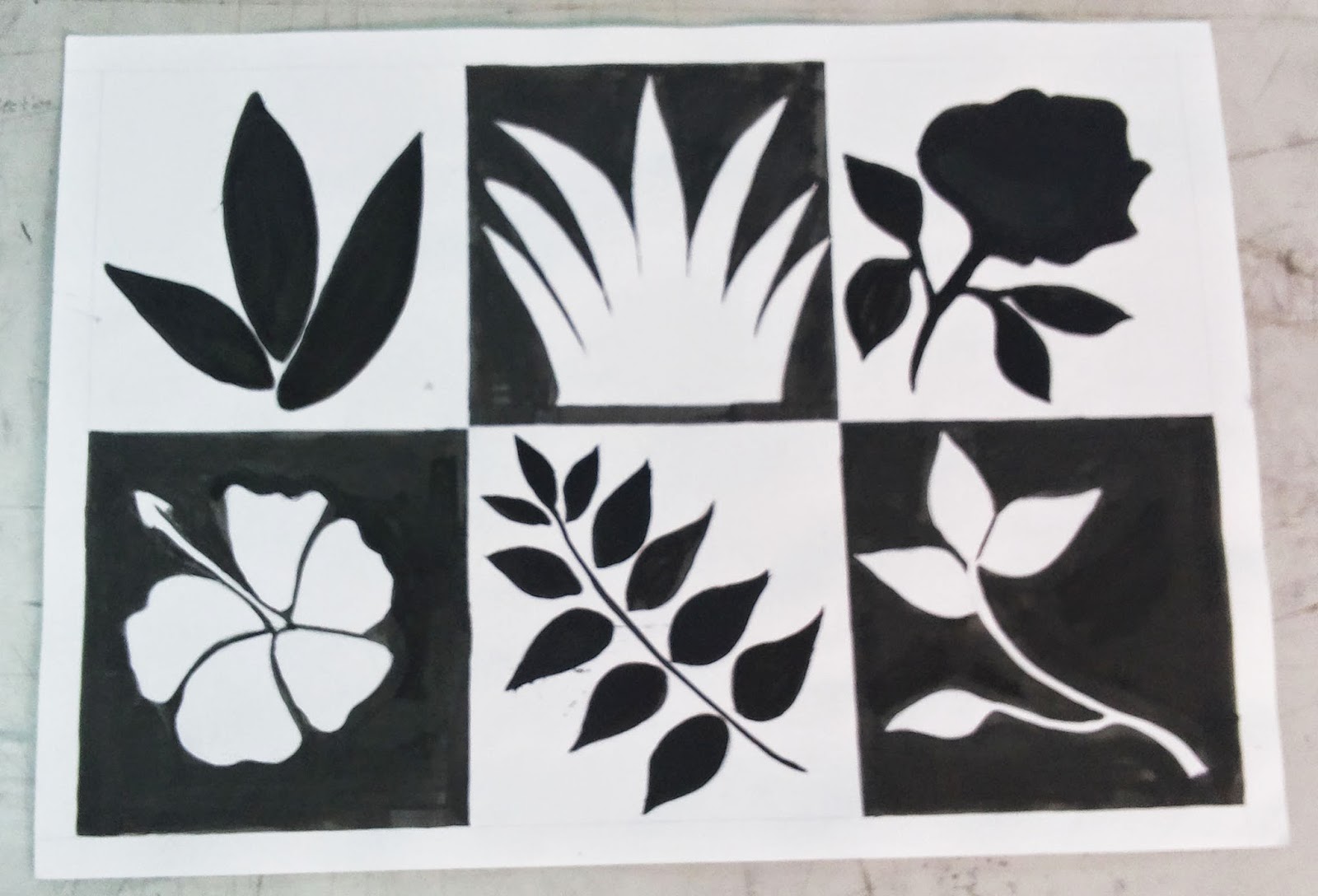
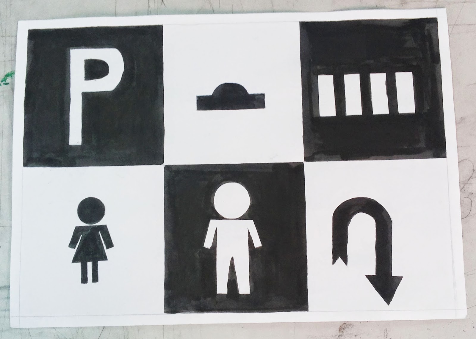
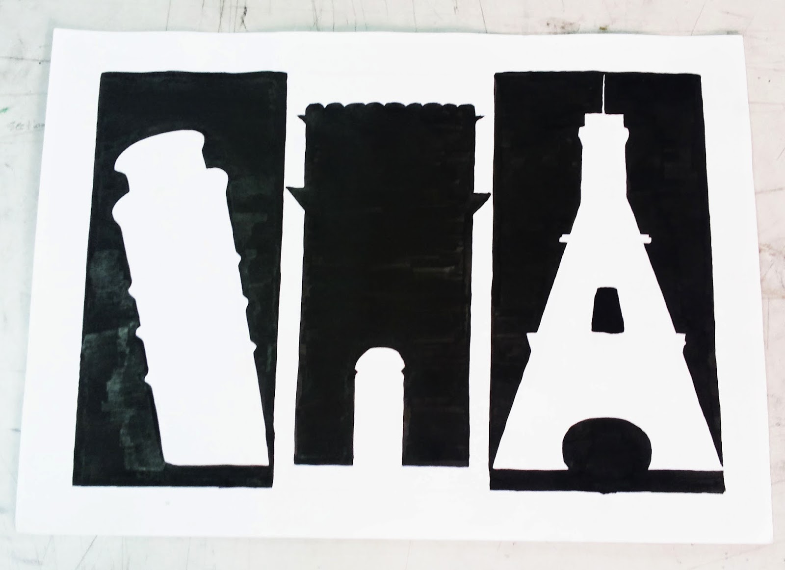
5) Value/tonal contrast
   
      value is the degree of light and dark in a design. It is the contrast between black and white and all           the tones. Value can be used with color as well as black and white.
     
     The greater the difference the more attention the area attracts. Its the one of the most powerful               tool to define the centre or interest in a painting. Having the less tonal contrast in the                               foreground allows the object to dominate and so not confuse the viewer. Simple abstract                         marks such as this foreground play an important part in the composition of the painting . Their job is       to lead the eye bags to the centre of interest. They must have enough strength to do this while not         drawing attention away from the centre of interest. Delicate tonal adjustment is often necessary to           get the balance right.

    types of value color:-


FINAL VALUE 


6) Form
 
    Form is any three-dimensional object. Form can be measured, from top to bottom (height), side to side (width) and from back to front (depth).


7) Wire sculpture

A wire sculpture is a figure, piece of jewelry, or other decorative item that has been formed and shaped out of wire.

proses :-


THE PRINCIPLE OF DESIGN

The Principles of design can be thought of as what we do to the elements of design. How we apply the Principles of design determines how successful we are in creating a work of art. There are 5 principal of design.

1) Balance 
   
Balance is the concept of visual equilibrium, and relates to our physical sense of balance. It is a reconciliation of opposing forces in a composition that results in visual stability. Most successful compositions achieve balance in one of two ways: symmetrically or asymmetrically. Balance in a three dimensional object is easy to understand; if balance isn't achieved, the object tips over. To understand balance in a two dimensional composition, we must use our imaginations to carry this three dimensional analogy forward to the flat surface.


2) Proportion

Proportion refers to the relative size and scale of the various elements in a design. The issue is the relationship between objects, or parts, of a whole. This means that it is necessary to discuss proportion in terms of the context or standard used to determine proportions.

Our most universal standard of measurement is the human body; that is, our experience of living in our own bodies. We judge the appropriateness of size of objects by that measure. For example, a sofa in the form of a hand is startling because of the distortion of expected proportion, and becomes the center of attention in the room.

3) Rhythm

Rhythm is the repetition of visual movement of the elements-colors, shapes, lines, values, forms, spaces, and textures. Variety is essential to keep rhythms exciting and active, and to avoid monotony. Movement and rhythm work together to create the visual equivalent of a musical beat.

4) Emphasis

Emphasis is also referred to as point of focus, or interruption. It marks the locations in a composition which most strongly draw the viewers attention. Usually there is a primary, or main, point of emphasis, with perhaps secondary emphases in other parts of the composition. The emphasis is usually an interruption in the fundamental pattern or movement of the viewers eye through the composition, or a break in the rhythm.

5) Unity

Unity is the underlying principle that summarizes all of the principles and elements of design. It refers to the coherence of the whole, the sense that all of the parts are working together to achieve a common result; a harmony of all the parts.