BASIC COLOR STUDIES : MY CREATIVE COLOR WHEEL
what is color?
Color is simply light of different wavelength and frequency and light is just one form of energy that we can actually see that is made up from photos. We are all surrounded by electromagnetic waves of energy of which color is just a small part.
these three categories of color:
a) primary color
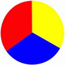
primary color are the 3 pigment colors that can not be mixed or formed by any combination of other colors. All other colors are derived from these 3 hues.
b) secondary color

b) secondary color
Secondary colors are created from a mixture of two primary colors.
a. red + yellow = oren
b. red + blue = purple
c. yellow + blue = green
c) tertiary color
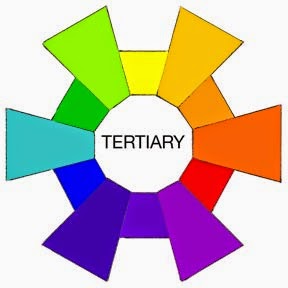
Yellow-orange, red-orange, red-purple, blue-purple, blue-green and yellow-green. These are the colors formed by mixing a primary and secondary color. That's why the hue is a two word name, such as blue-green, red-violet and yellow-orange.
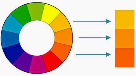
analogous color - analogous colors are groups of three colors that are next to each other on the color wheel , with one being the dominant color, which tends to be a primary or secondary color and one on either side of the color.
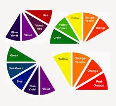
Yellow-orange, red-orange, red-purple, blue-purple, blue-green and yellow-green. These are the colors formed by mixing a primary and secondary color. That's why the hue is a two word name, such as blue-green, red-violet and yellow-orange.

analogous color - analogous colors are groups of three colors that are next to each other on the color wheel , with one being the dominant color, which tends to be a primary or secondary color and one on either side of the color.


so, for our task in subject intro to color study, we need to sketch and try to used and mixed the color.
when i try to get the inspire to making a sketch, actually i was watching the twilight saga. so, when i see Jacob ( Taylor Lautner) turn to wolf i get the idea to sketch the wolf and imagine by using it's feather i can put the primary color, secondary color and tertiary color on its body. so, i sketch it and i put the primary color on its face. next, I put the secondary color on its neck and tertiary color on its body. lastly, for the background I used the analogous color which is orange,orange yellow and yellow. from this task i had learned how to mix the color, how to put it and yes, during do this task I enjoyed it.
this is my process while doing my artwork.
TASK 2
COLOR PSYCHOLOGY
My doodles is all about fauna. I try to combine the animal from sea such like, fish, crab, jelly fish, squid, seahorses, dolphin and snail . Other than that, the animal from land is bird, eagle and ladybird. During coloring my doodles I am using 2 types of color, firstly, water color and secondly, pencil color. I used soft color for my doodles such like blue, red,orange, yellow, violet, green and grey. The blue color is one of trust, honesty and loyalty. But, from a psychology perspective, blue is reliable and responsible. Other than that, this color also exhibits an inner security and confident.
Red color is a warm and positive color associated with our most physical needs and our will to survive. It exudes a strong and powerful masculine energy.
Red is energizing. It excites the emotions and motivates us to take action.
It signifies a pioneering spirit and leadership qualities, promoting ambition and determination.
The color orange radiates warmth and happiness, combining the physical energy and stimulation of red with the cheerfulness of yellow. Orange relates to 'gut reaction' or our gut instincts, as opposed to the physical reaction of red or the mental reaction of yellow. Orange offers emotional strength in difficult times. It helps us to bounce back from disappointments and despair, assisting in recovery from grief.
This yellow color relates to acquired knowledge. It is the color which resonates with the left or logic side of the brain stimulating our mental faculties and creating mental agility and perception. Being the lightest hue of the spectrum, the color psychology of yellow is uplifting and illuminating, offering hope, happiness, cheerfulness and fun.
This color relates to the imagination and spirituality. It stimulates the imagination and inspires high ideals. It is an introspective color, allowing us to get in touch with our deeper thoughts. The difference between violet and purple is that violet appears in the visible light spectrum, or rainbow, whereas purple is simply a mix of red and blue. Violet has the highest vibration in the visible spectrum. While the violet is not quite as intense as purple, its essence is similar. Generally the names are interchangeable and the meaning of the colors is similar. Both contain the energy and strength of red with the spirituality and integrity of blue. This is the union of body and soul creating a balance between our physical and our spiritual energies.
This is the color of balance and harmony. From a color psychology perspective, it is the great balance of the heart and the emotions, creating equilibrium between the head and the heart. From a meaning of colors perspective, green is also the color of growth, the color of spring, of renewal and rebirth. It renews and restores depleted energy. It is the sanctuary away from the stresses of modern living, restoring us back to a sense of well being. This is why there is so much of this relaxing color on the earth, and why we need to keep it that way. Green is an emotionally positive color, giving us the ability to love and nurture ourselves and others unconditionally. A natural peacemaker, it must avoid the tendency to become a martyr.
The color gray is an unemotional color. It is detached, neutral, impartial and indecisive - the fence-sitter. From a color psychology perspective, gray is the color of compromise - being neither black nor white, it is the transition between two non-colors. The closer gray gets to black, the more dramatic and mysterious it becomes. The closer it gets to silver or white, the more illuminating and lively it becomes.


No comments:
Post a Comment